A Kaleidoscope of Color
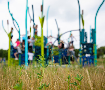
Color is everywhere. Its impact is often more deeply felt than expressed. Color is just as important to the play experience as form. When applied with thoughtful inspiration, the right color choices can play across all playstructure materials to add visual texture and sculptural interest.
With this in mind, we’ve developed our own gorgeous and rich proprietary colors. It’s an intentional shift to provide our clients with better options and introduce the world to a fuller spectrum when it comes to playgrounds.
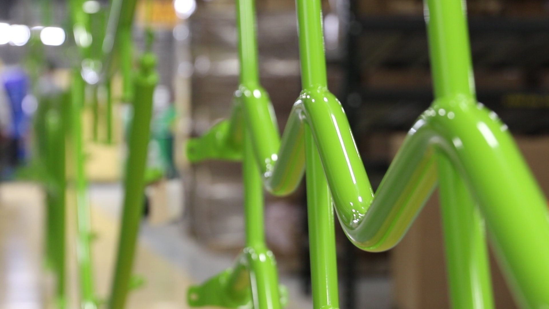
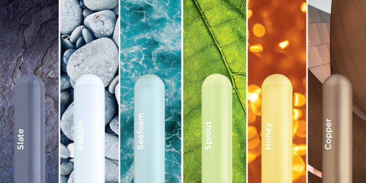
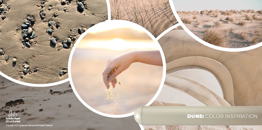
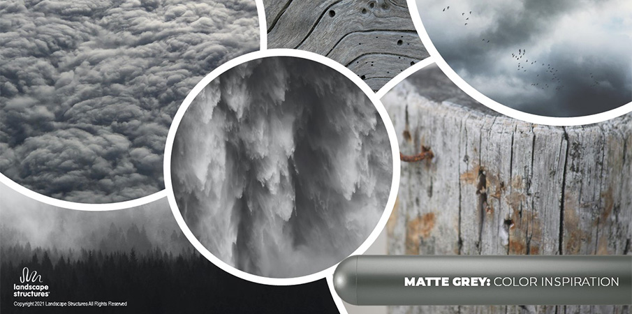
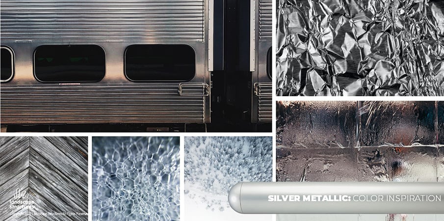
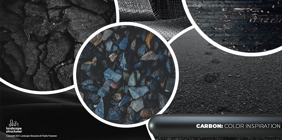
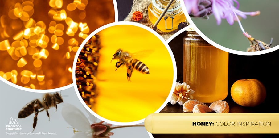
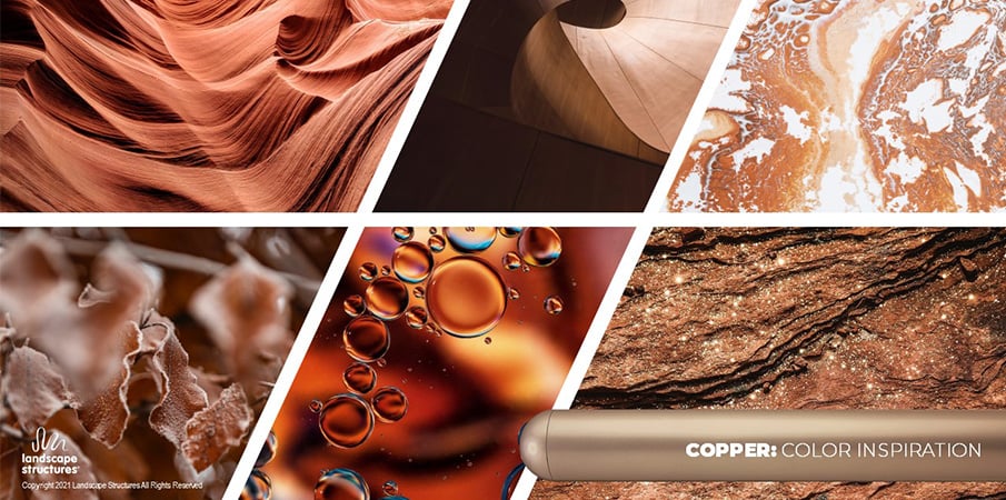
Created to complement the vibrant saturated colors in our existing palette these nature-inspired matte metallics have a subtle sparkle that gives them eye-catching dimension. The unique finish creates a soft, smooth feel to the touch.
Our brilliant collection of playground colors features nature-inspired shades, urban tones, playful hues and everything in between. Each imaginative shade has been carefully selected to be both current and enduring—creating a spectrum that’ll wow kids now and over the long life of the structure.
Inspiration for our Colors


"Color doesn’t just offer decorative value, it directly affects our emotions, behaviors, and well-being."
You Don’t Have to Be an Expert
Lean on our color leadership
Because color is the first thing that the human eye sees, it immediately impacts how children respond to a playground, along with the forms of the structure and how a playground plays, it is one of the most important decisions that can be made when designing a playground environment.
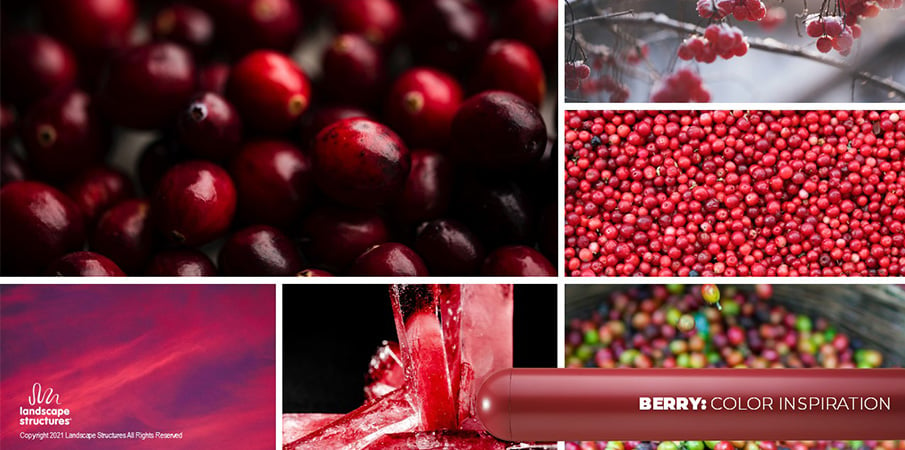
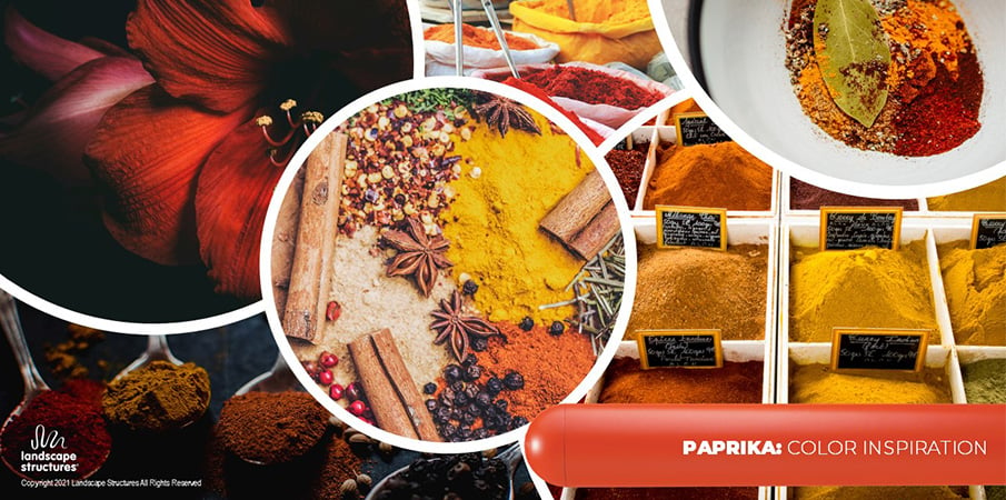
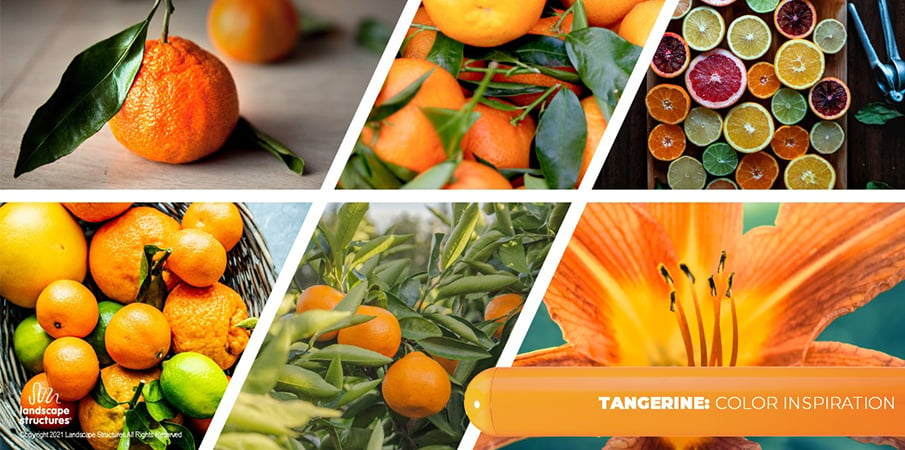
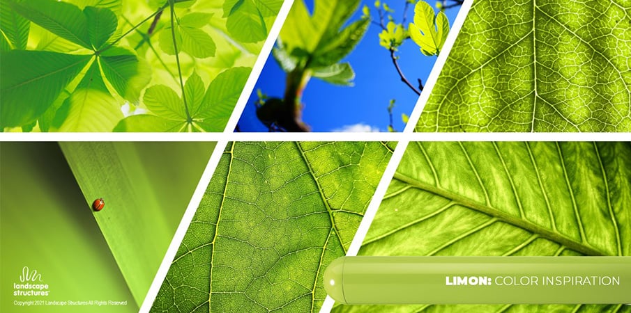
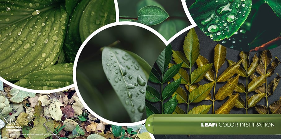
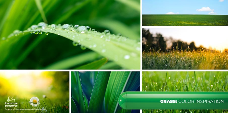
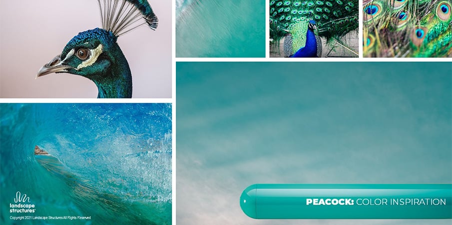
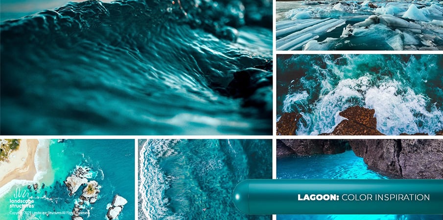
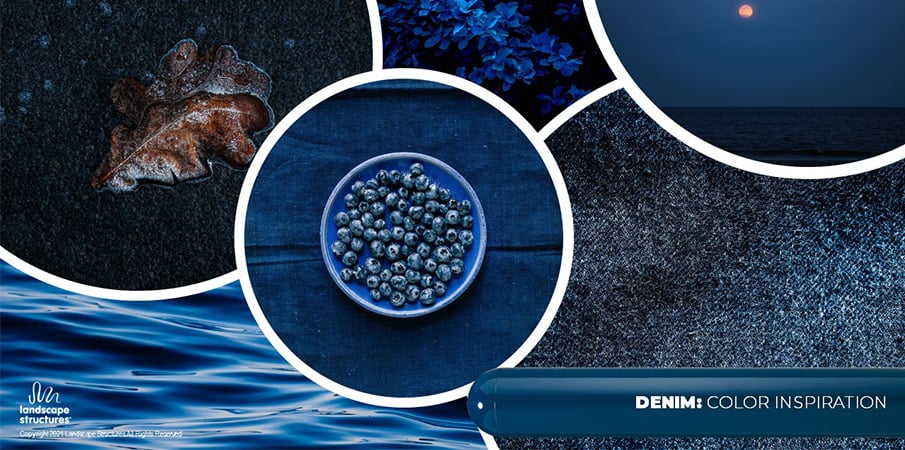
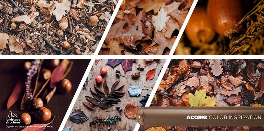
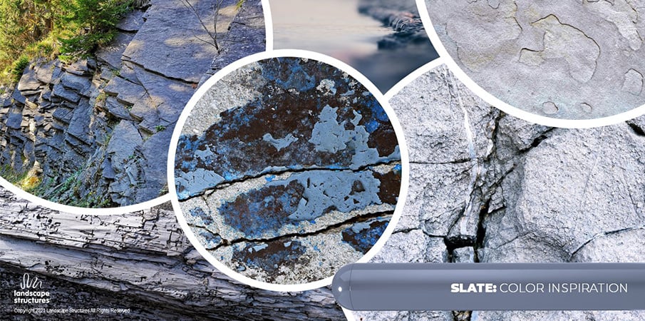
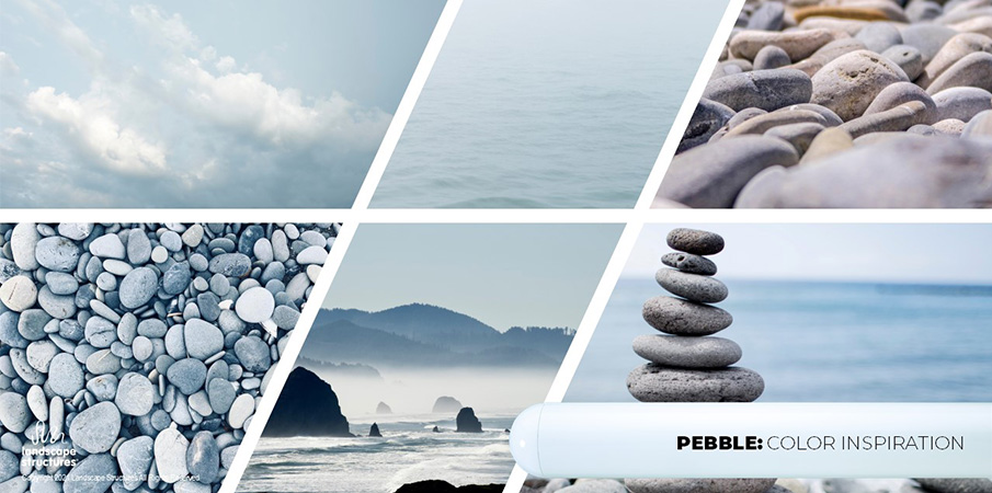
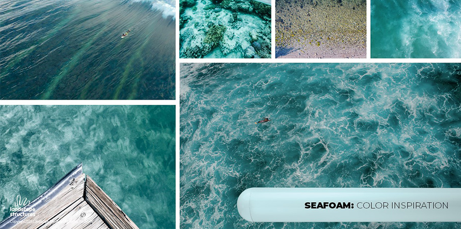
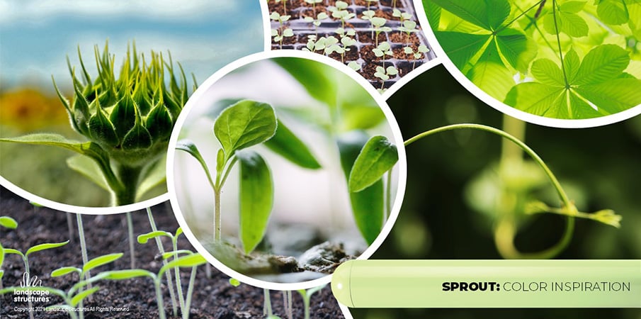
Our colors focus on colors found in nature because the colors are familiar and the playstructures will mostly be in nature, surrounded by nature, and can be in the ground for decades.
We tried to take some of the guesswork out of the way by creating complementary palettes, colors selected for their versatility and ability to create a unified color story. We can also consult with you based upon the proposed play location. Choose from our recommended color palettes—or browse our Color by Material page to mix and match your own palette.

"Color is a living, breathing thing that changes with each structure, telling a different story within different environments."
Learn How Color Impacts Us
Continuing education on color theory
Color is so powerful that it impacts our mood and behavior. It can make us feel calm and relaxed, energized and uplifted, or anything in between.
Children's developing brains are especially impacted by the colors in their environment, so when designing a playground, its color should be carefully chosen to create the sort of tone your playground plan requires.
To learn more about how color impacts children on the playground, explore our 200-level continuing education seminar "The Power of Color: Impact on Mood, Feelings and Behaviors on the Playground." We are pleased to offer a full selection of continuing education seminars to help you plan the ideal play experience.